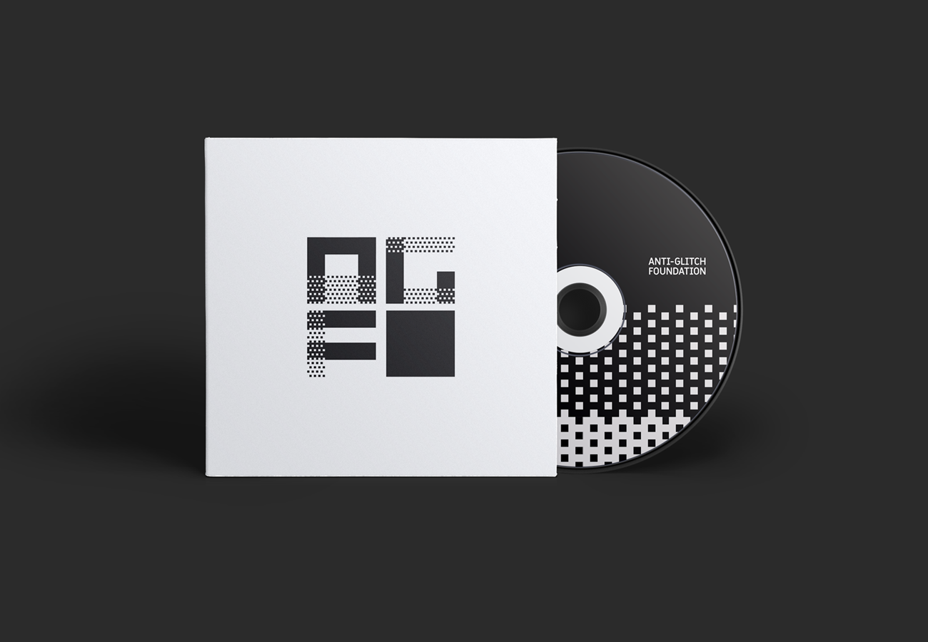
Anti-glitch Foundation is a post production boutique, specialized in color grading for digital cinema and advertising.
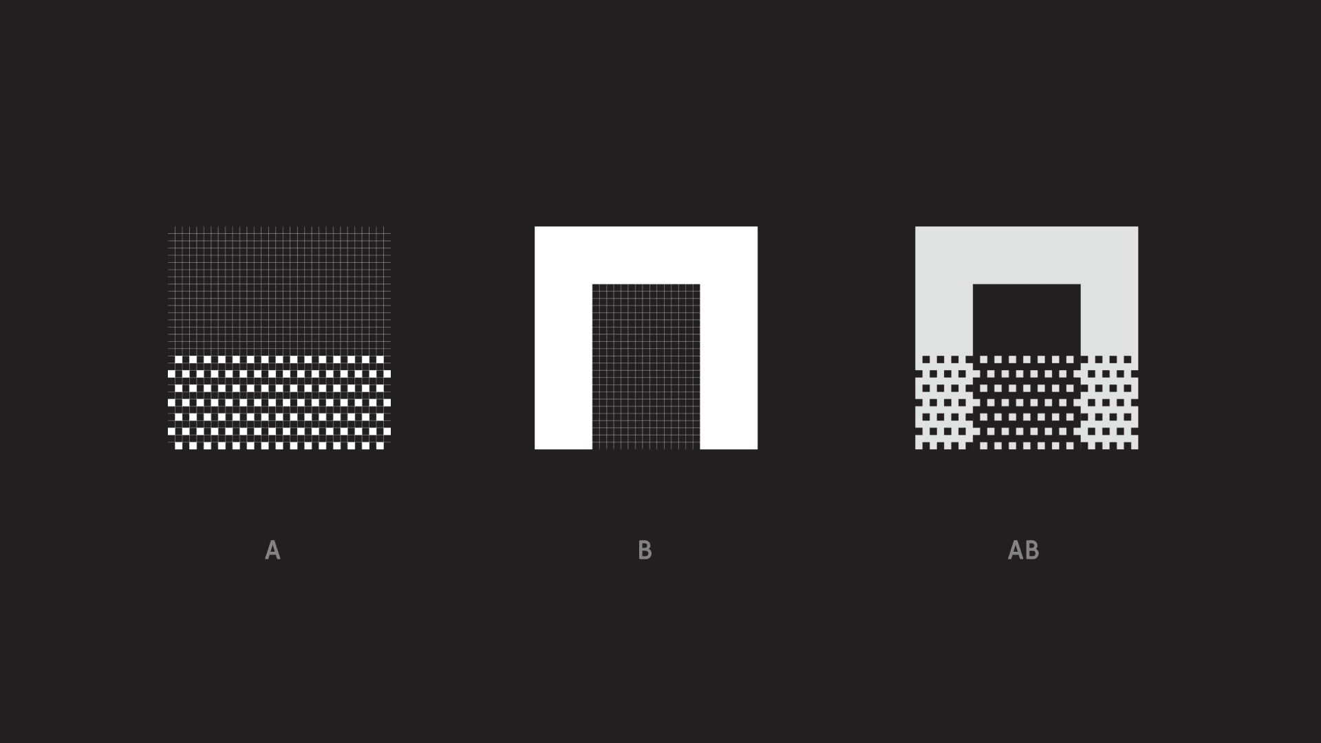
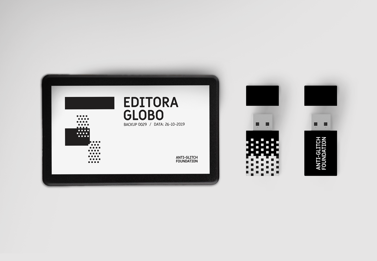
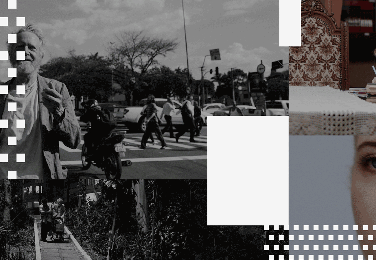
Its visual identity is based on film concepts such as fragments, montage, exaggeration and conflict. Its visual universe is inspired by the 8 bit language; the incomprehension and inconsistency left by glitches; and the half-tones present on low-res technology. With these concepts in mind, a typography was developed where each letter is made out of the combination of the two weights on the font set (A and B), creating a unique and rich visual universe for the brand.


This project was developed during my time at Papanapa Studio.